A Website that Says Chicago
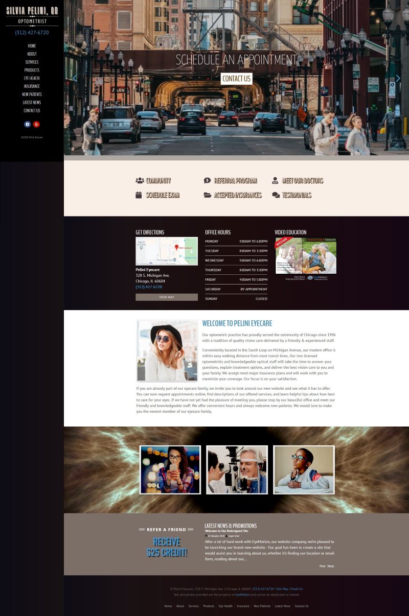
With a stunning practice located on Michigan Avenue in the heart of the city, Dr. Silvia Pelini knew she wanted a website that said "Chicago."

After talking with her, we realized our Scenic design could be customized to create the look she was going for. Vintage sepia tones and touches of blue combined to form a palette created just for her. We took inspiration from the distinctive 3-D font used in her logo, and added header title fonts to tie the logo into the site and create visual interest.
Next, we found the perfect video snippet for the large image area on the homepage -- time-lapse footage of downtown Chigago. The video features the hustle and bustle of pedestrians, traffic, and the Chicago "L" train.
We enjoyed working on this site and adding personalized touched for Dr. Pelini--and we think prospective patients will be drawn to her beautiful office by this beautiful new site!

