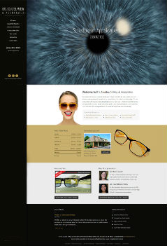
New Website for Drs. Coulter, McRoy & Associates

What do you get when you combine strong simple colors, eye-catching graphics, and a great optometry practice? Our recently-completed website for Drs. Coulter, McRoy & Associates, of course!
This site was built with Scenic (style 3), our newest Advanced design. Instead of a large static photo at top, the practice requested a looping video of a dilating pupil, which does a great job of adding interest and capturing attention. We also added some other special touches, such as some of the home page graphics that slide into place as the viewer scrolls down the page.
Everything is easy to find, and with the blog functionality, the office will be able to keep its patients informed of all the latest offerings, promotions, and more.
We invite you to take a closer look at the new EyeMotion website —you just might be inspired with some ideas for a new look for your own site. We’d love to answer any questions you might have. Email us, or call 866.595.1476, and let us know you loved this look!

