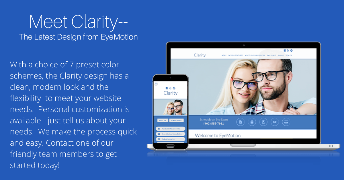
Meet Clarity

If you are looking for a fresh, modern feel for your optometric website, take a look at Clarity, our newest website design.
Clarity features eye-catching photos and icons, adding lots of visual interest. It fills out the page on larger screens, while also providing a great look and experience on smaller, mobile screens.
While Clarity comes ready to go with 7 fresh, brand-friendly color schemes and several Google fonts, we are able to customize virtually any color or typography element to suit your logo and brand.
As with each project, simply tell us what you'd like featured on your site, provide your logo and a few photos of your office if possible, and we can begin creating something truly unique for you. If you'd like the process to go even quicker, just choose one of the preset styles, and we can get you rolling in no time.
Our goal at EyeMotion is always to make your life simpler. You've got a lot on your plate, and we want you to feel comfortable delegating your practice website production to us.
If you’ve been thinking it might be time for a website revamp, now would be a perfect time to get in on a great promotion we’re running. We’d love to talk with you about Clarity or any of our other classic Advanced designs.
BONUS: In addition to the savings in our current promotion, we’re offering an additional $100 off to anyone mentioning they saw this offer.
Call us today at 866-595-1476 (ext. #1 for Rod, ext. #2 for Stephanie, or ext. #3 for Julie) or email us here.

