New Clarity Design Perfect for Clarity Vision Care
When Dr. Hieu Huynh first contacted us regarding a new website for Clarity Vision Care, we hadn't even officially released our new Clarity design.

But we were getting close, and so we decided to give the doctor a sneak peak at our almost-ready new look. And she knew right away that this was the aesthetic she wanted for her practice.
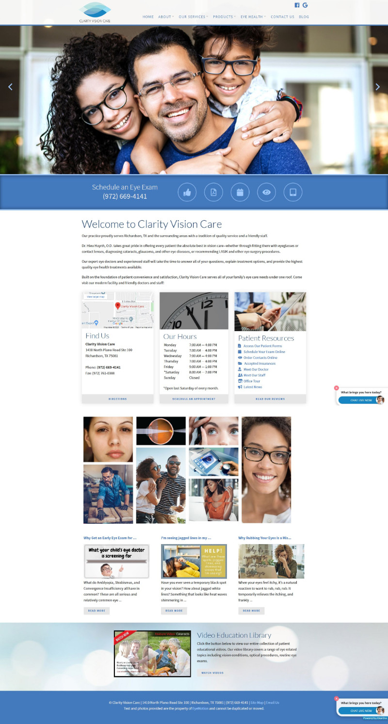
Clarity Vision Care is a beautiful, bustling practice in Richardson, TX, an affluent suburb of Dallas. Many of the world's largest telecommunications and insurance companies have major headquarters here. The crisp, clean, modern feel of EyeMotion's Clarity design just seemed to match the open, techie feel of Dr. Huynh's location.
She opted for a medium blue and white color palette, which tied in nicely with the blues of her logo and the blues in the pictures we chose for the eye-catching slideshow. A Patient Resources area, with easy-to-find links to important features such as forms and appointment scheduling, and an interactive linkable photo collage feature prominently on the home page.
We enjoyed working on this site with Dr. Hieu Huynh and are so pleased that she's pleased! And with our responsive customer service, we'll continue to be just a phone call or email away any time she needs assistance in the future.

